A simple and beautiful approach to designing better experiences for migrants
Chris Whitcomb
April 24, 2023
Social Sharing
Earlier this year, New York City made the decision to relocate 1,000 adult single male migrants to the Brooklyn Cruise Terminal in Red Hook. As a sanctuary city, New York has welcomed thousands of migrants in recent years and has sought different solutions to help give them shelter.
Kimberly Silver, a member of our Blue Cottage of CannonDesign team, lives in Red Hook in close proximity to the Brooklyn Cruise Terminal. She could literally see the shelter from her apartment and on her walk to the ferry each day, and kept hearing city officials talk about wanting to do a better job acclimating the migrants to the Red Hook neighborhood. A specific example of this sentiment came when Gale Brewer, the City Council Member for District 6 in Manhattan, told Documented that “More can be done to orient people in the area.”
Inspired by this notion, Kimberly united a team within CannonDesign (Steffany Brady, Dylan Coonrad and Abbey Furlow) to explore how design could play a pivotal role in helping orient migrants in cities and neighborhoods completely foreign to them.
Testimonials
The team ultimately identified low-commitment, easy-to-install signage and wayfinding ideas that local governments and civic agencies could more easily and quickly deploy across neighborhoods to connect migrants in these situations. The ideas also create opportunities to infuse joy, storytelling and nods to the journeys these migrants are each on.
The team recognized that simply investing in graphics and art could achieve three core functions for migrant communities, including:
- Connections to TRANSIT: How can thoughtful signage, wayfinding and mapping help migrants better understand how far they are from buses, subway stations and/or ferries that empower them to travel to jobs, visit family members housed elsewhere in the city and/or access critical resources like healthcare.
- Connections to NEIGHBORHOOD: Can we use a combination of signage and mobile technology that does not require WiFi to help migrants better immerse in the neighborhoods where they now live? Media coverage of the Red Hook situation makes clear that these individuals do receive phones. How can we ensure they can use them to be more aware of resources that surround them to help make their massive life transition less abrupt?
- Connections to HOPE: How can we create diverse public art that brightens spaces near where migrants live and help them find more joy, hope and optimism in their day to day. Could this public art pay tribute to the significance of their journeys?
The team believed a strategic combination of these elements: signage, wayfinding, art and mobile tech non reliant on WiFi could lead to significantly better and brighter experiences for migrants. Again, these wayfinding elements can be both useful and rooted in deep respect for the diverse cultures represented by migrants.
While New York City has since closed the shelter in the Brooklyn Cruise Terminal in Red Hook, these ideas could be applied to urban wayfinding in any city where migrants and refugees live. Here’s a deeper look at some of our proposed solutions.
An Observation: Fencing. Concrete barrier. Pavement.
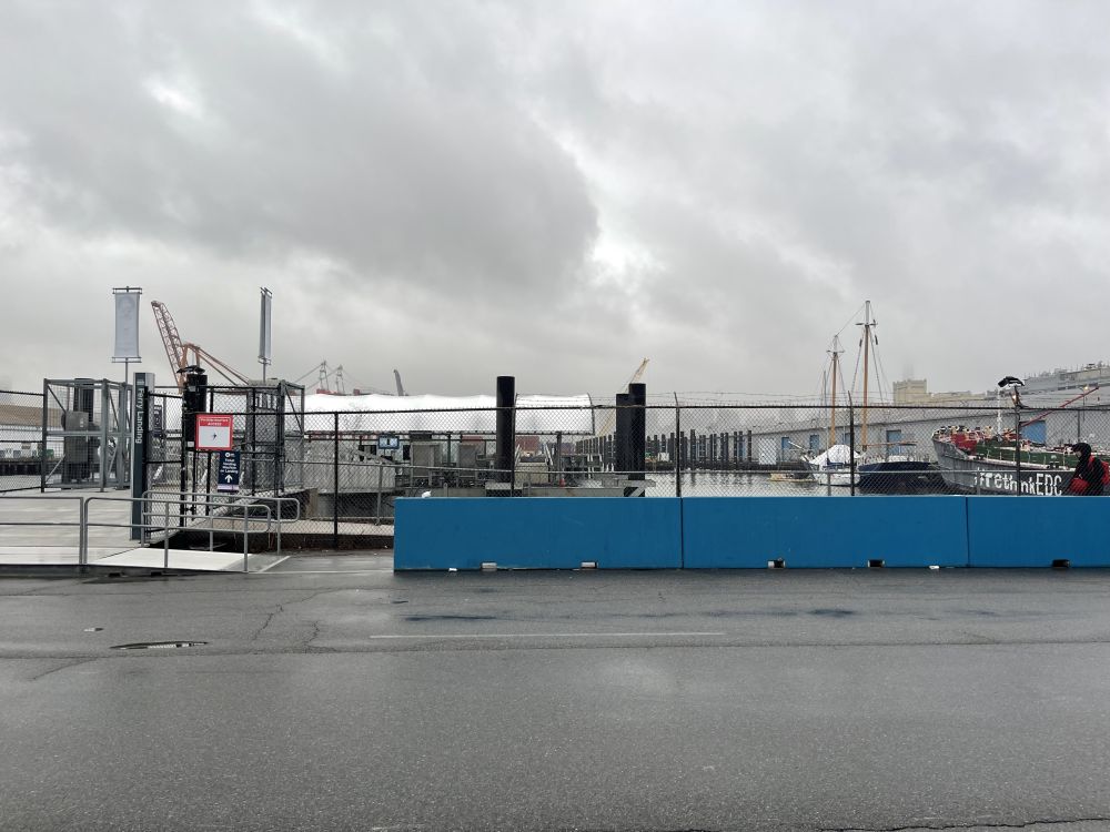
After introducing the idea to our CannonDesign team, Kimberly walked the area around the migrant shelter and sent photos to the larger team.
One observation the team made visually is that the area features extensive stretches where fencing, concrete barriers and pavement all worked together to indicate walking patterns and/or secure certain areas. Knowing these materials would likely be commonplace around migrant shelters, the team developed a solution that activates all three surfaces for unique purposes.
Connect to TRANSIT (Pavement)
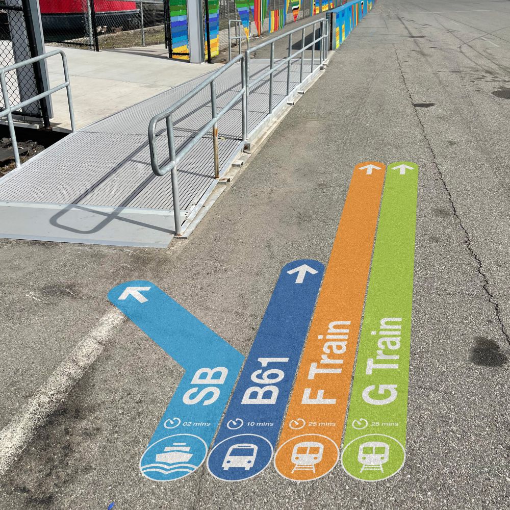
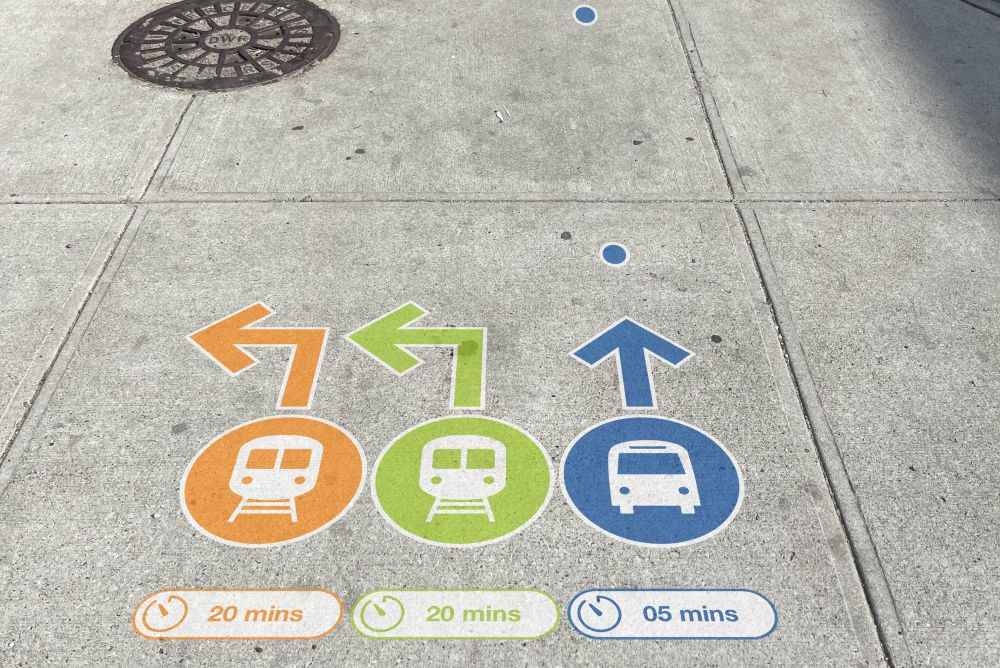
Our proposal activates the pavement with a painted wayfinding system that makes very clear the direction and distance to key public transit like the subway, buses or ferry.
Using economical and easy-to-implement solutions reliant on color, clear labeling, pictograms and approximate time measures, this simple wayfinding system helps migrants more easily locate transit options to connect with family, jobs and/or other key resources.
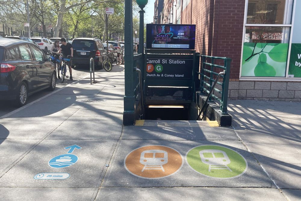
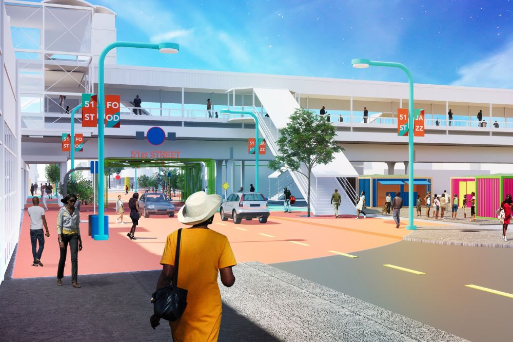
This wayfinding system can be carried beyond immediate barriers and walkways surrounding the migrant facility and continue to help individuals navigate as they move through the city. Almost like trail markers, here are other examples of how this graphic navigation system can be carried forward on street corners, at subway stations and other areas.
Connect to NEIGHBORHOOD (Better Digital Maps)
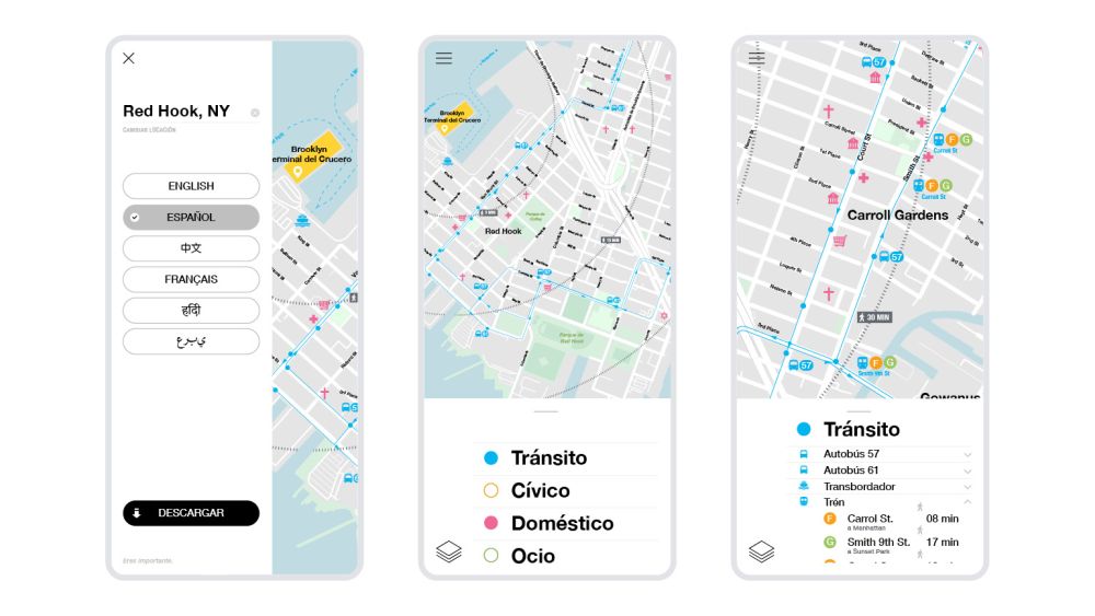
One thing we noted in the media coverage of the situation in Red Hook is that the migrants were given free phones and Metrocards. We thought designing clear maps that could be accessed on these phones, even without WiFi, would be a great step in helping them better orient themselves to the communities where they now live.
Using simple radial lines and multilingual translations, the maps could serve as digital wayfinding guides to help these individuals understand if they are 5, 10, 15 or more minutes away from grocery stores, places of worship, banks, healthcare and/or other critical resources.
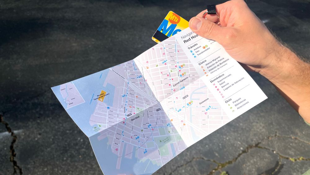
The team also imagined portions of these maps could be printed and given to the migrants as cards similar in size to a Metrocard and/or provided ID information. They could use them even when they don’t have phone access.
Connect to HOPE (Fencing and Beyond)
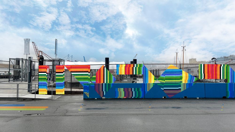
The team also developed a proposed solution that would infuse vibrant public art around these migrant shelters, specifically via the fencing that often surrounds them.
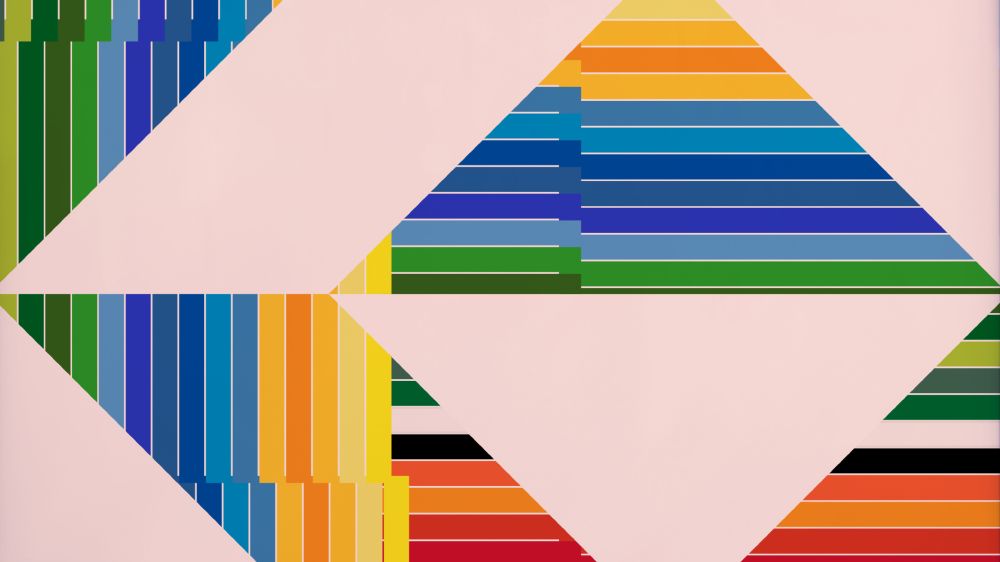
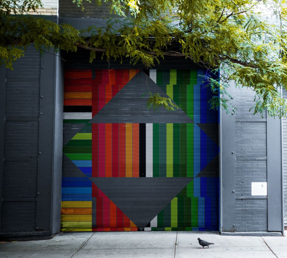
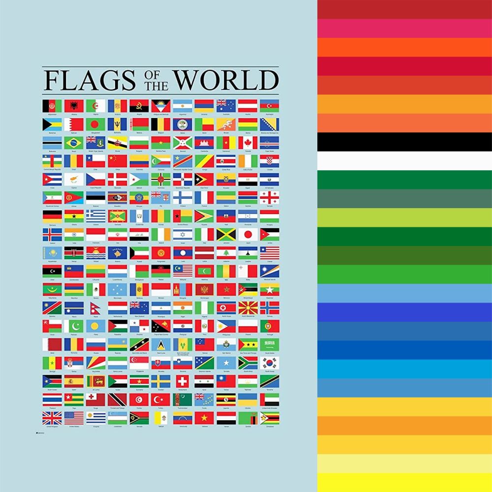
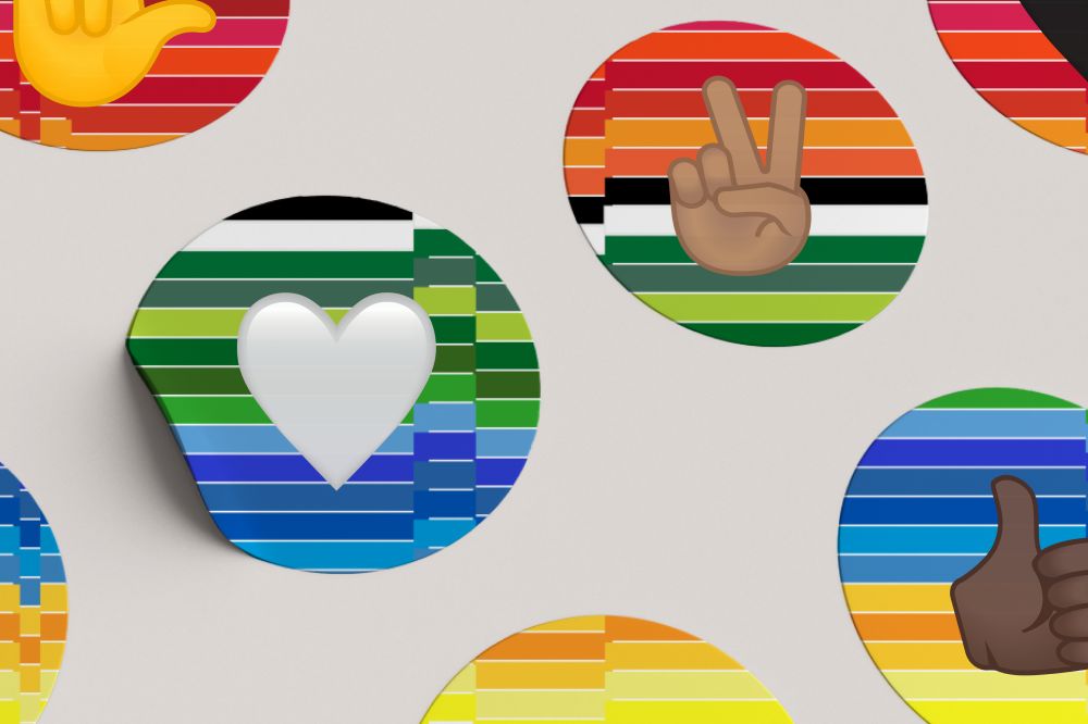
Our mural idea is rooted in the shape and colors of flags from across the world. It is vibrant and joyful and alludes to the wonderful blending of cultures immigration empowers.
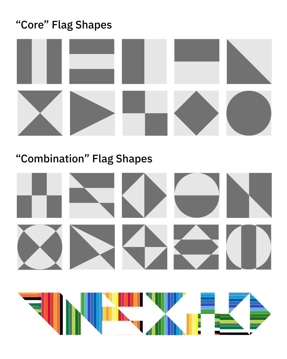
These murals are designed around the geometric realities of flags and intentionally “drag” color horizontally and vertically until it is interrupted by seemingly abrupt chromatic striations. This is intentional and meant to allude to both the journey aspect of immigration and the abrupt shifts it often represents in individuals lives.
Testimonials
To help inform the mural design, the team created a set of shapes derived from the anatomy of international flags. This exercise helped the team create a strong balance of both colorful graphics and viewing windows.
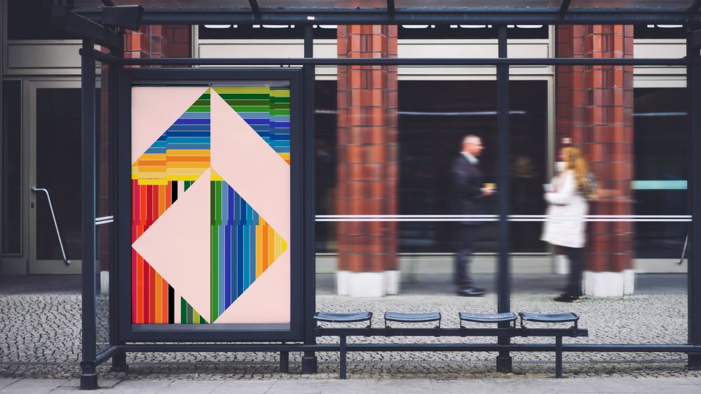
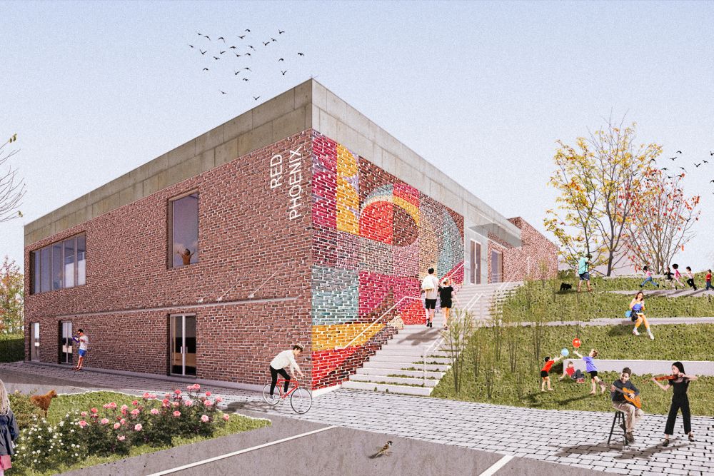
While this solution is designed to activate fencing, it can continue on to other common urban spaces to further orient and guide people. Below are examples of how this design may carry through on a building or bus stop.
All of this creative work stems back to the idea of better orienting migrants to the communities they now call home.
Immigration is a complex process and those who come to America need support across a diverse spectrum that includes finding work, accessing healthcare, connecting with family and much more. However, we believe the system outlined above could help with orientation in a low-cost and beautiful manner.
